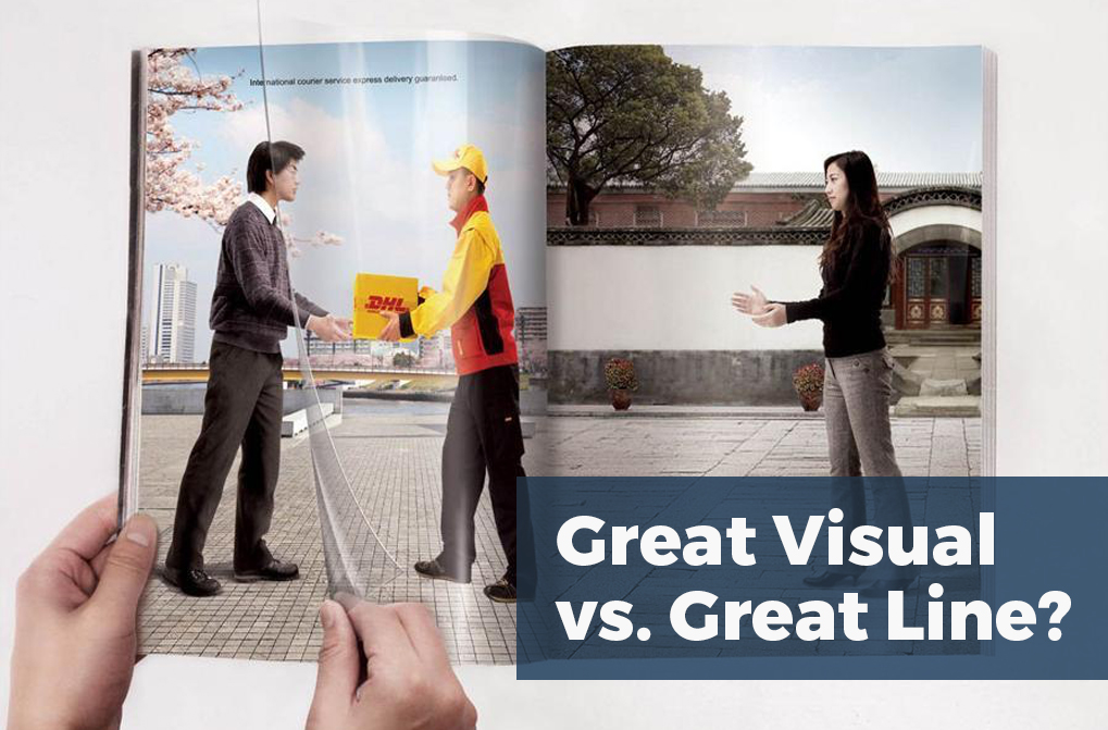
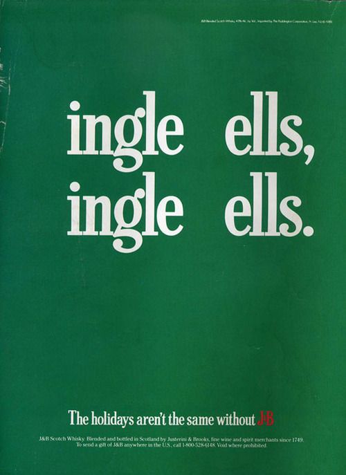
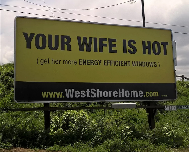
Perhaps the longest-running debate in advertising is whether a great headline is better than a great design or visual. On one side, people propose that if you have a killer line, you don’t need a visual at all. While on the other side, people will say that an outstanding visual doesn’t need any text to support it. Obviously, if you’re talking to a writer, they will almost always say the former and likewise, a designer or art director will say the later.
Certainly, it mostly depends on the person viewing the work. We’re all different, and some people tend to be more literal and some more visual, while some love both.
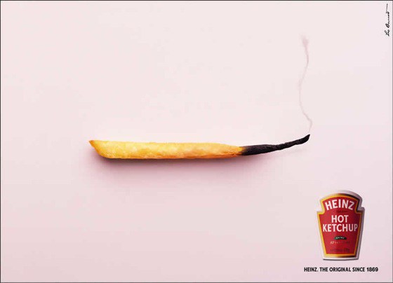
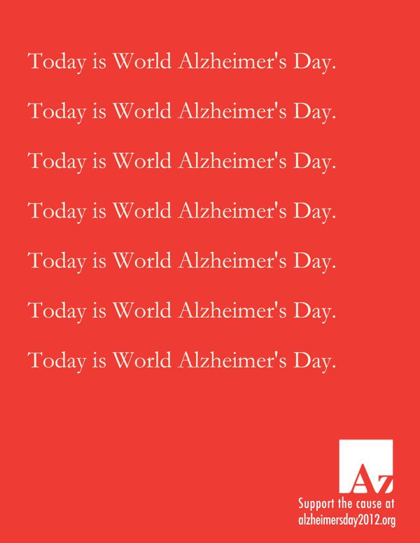
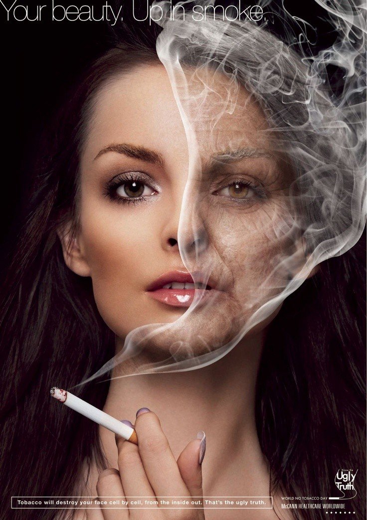
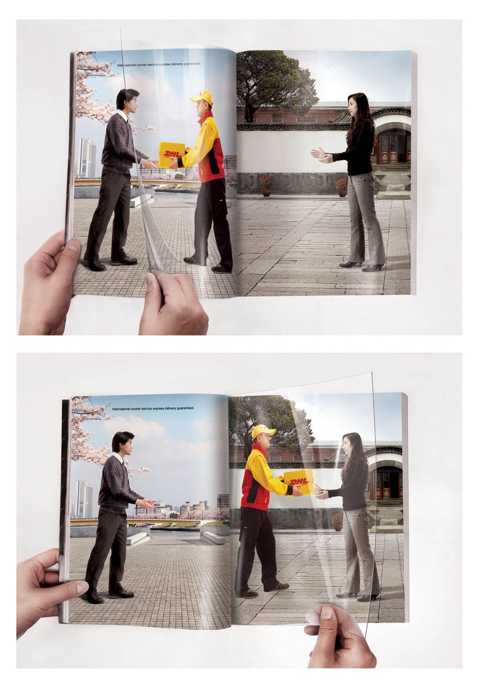
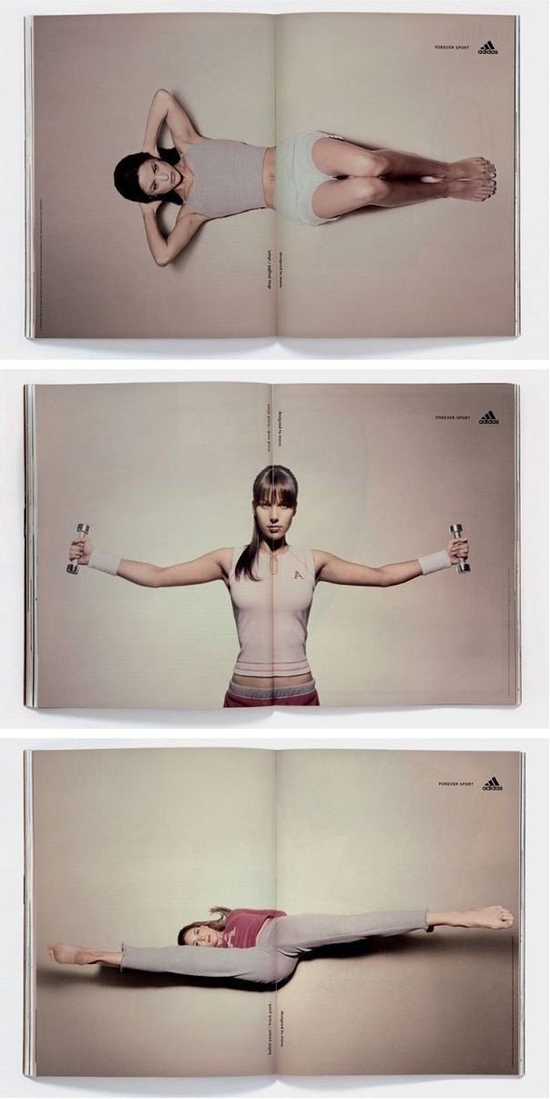
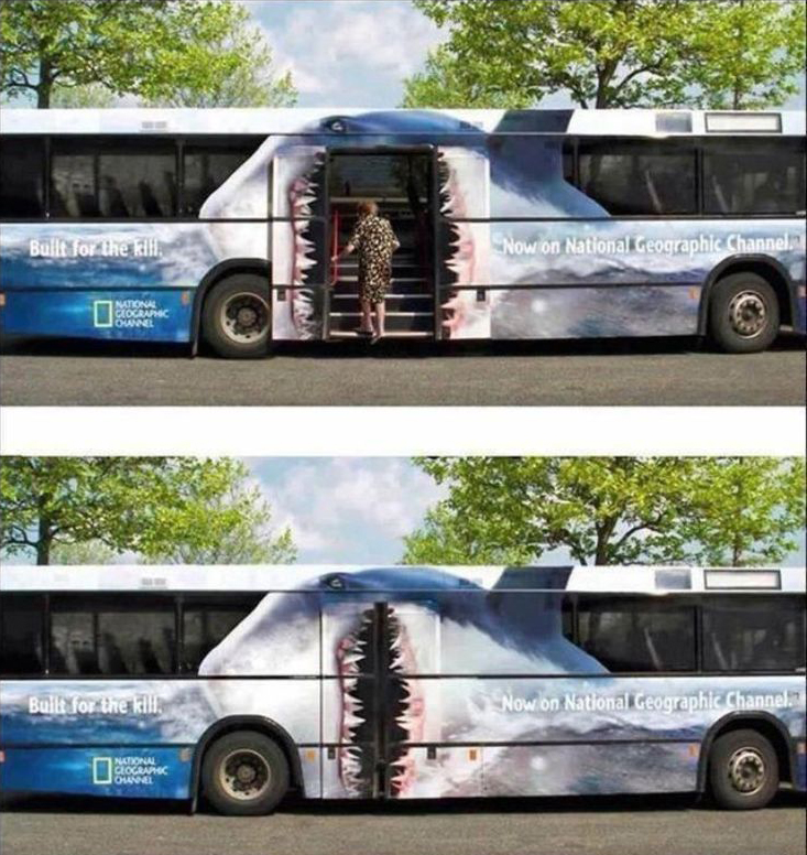
For the purpose of settling this debate, I thought I’d share some interesting examples of each so you can be the judge of what works best. Perhaps you’ll feel strongly one way or another, or maybe you’ll like a little of both. Have a look and let’s hear what you think is the best approach!
Click the image to load the gallery, or use the right/left arrows:

The key is to advertise in a way that’s memorable, compelling, and most importantly, on-brand for your business.
In my experience, using a great headline or a great design (or a combination of both) really depends on the person viewing it, hence either can work really well. The key to advertising is to use messaging, either visual or written forms, in a way that’s memorable, compelling, and most importantly, on-brand for your business. Consequently, If you’re a button-upped sort of company, then you probably won’t want to get too cute with either the words or the design within your marketing. However, that doesn’t mean it can’t be impactful (note the Alzheimer’s Day ad example in the gallery above).
In my opinion, emotion is a key part of selling any good or service. Therefore, making the viewer feel something when they encounter your marketing, even if it’s getting a simple smile, goes a long way towards them taking the action to reach out and contact you or buy your product directly.
Comments