Quite often, it seems I’m asked “What do you do?” As a business that specializes in branding, logo design, and web design, a goal of mine for 2018 will be to share more work that I produce for my clients, to show people exactly what it is that I do. Even more so, I will be sharing the inside scoop on each project’s strategy to help to illustrate HOW I do what I do. Many people assume design is about making things look pretty, but effective design requires a solid strategy to net the best results. So with that in mind, sit back, relax, enjoy a sip of coffee, and allow me to take you behind the curtain for this insider’s look at the new custom logo design as part of the new rebrand, Fuse!
THE PROJECT Brief
The Traverse City Chamber of Commerce has long been an outstanding resource for businesses in the Greater Grand Traverse Area. They connect business people together in the community and also have many educational programs for professionals to take part in. One program in specific is geared towards young professionals in the area, the Traverse City Young Professionals group (or TCYP). TCYP specializes in bringing young professionals together for networking, skills training, and experienced-based mentoring—all great stuff for up-and-comers trying to get to the next level in their career. I’m especially fond of this program as I too am very passionate about mentoring young, talented, and driven people to help them reach their potential. The TCYPs are certainly my kind of people.
The issue the YPs, short for “Young Professionals,” (in case you hadn’t guessed) were having was with their brand identity. The general consensus was that the tone the group was putting out was a bit stodgy and outdated. The YPs felt that their image was affecting their ability to attract new members and wanted to update their image. Their existing logo was the epitome of this notion—the symbol itself was a series of linked briefcases, which pretty much no young person uses these days.
With that in mind, the Chamber started looking for a digital agency to help them with an image overhaul. They found Hardy Design Co. and LeadPlan Marketing, a local content marketing agency to be the perfect partners to assist. After an initial discovery session, together we established that a rebrand, replete with a new logo design, new message, and even a new name, would be the best course of action for the group’s makeover.
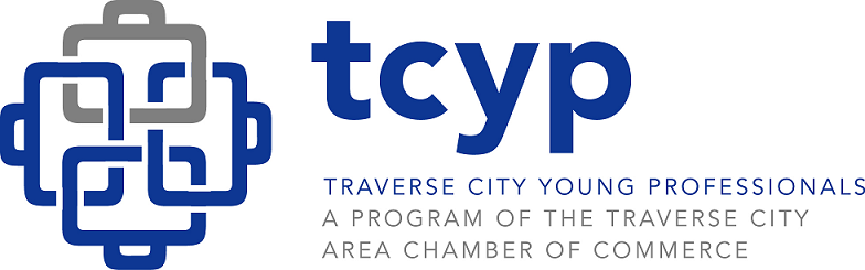
TCYP’s current logo, with its linked briefcase symbol, was no longer
up to the task of resonating with young professionals in the area:
STEP 1: THE NAME
The first item we needed to tackle was a new name for the group. I’ve been a part of dozens of renaming projects over the years and the naming process alone can be a hefty project in and of itself. Words can have such subtle meanings and naming a business or organization often proves more challenging than you would think.
We wanted a name that is young and energetic, professional, and something that wouldn’t alienate the groups older members. Several names were presented over 2 rounds of meetings. Of the names we pitched, a few stood out as contenders, but everyone lit up (no pun intended) when we presented “Fuse” as an option. As a word with multiple meanings, it tied into the idea of momentum, the lighting of a fuse behind these YPs. It also solidifies the notion of bringing these young people, their minds, and their experiences together into this dynamic group.
STEP 2: THE LOGO DESIGN
With the name in place, next up was the logo design itself. Logos are a tricky business as they need to effectively illustrate and drive home the ideas embodied by the group, as well as the imagery conjured up by the name itself. To top it off, a good logo needs to do this in a split second AND be memorable—what a task!
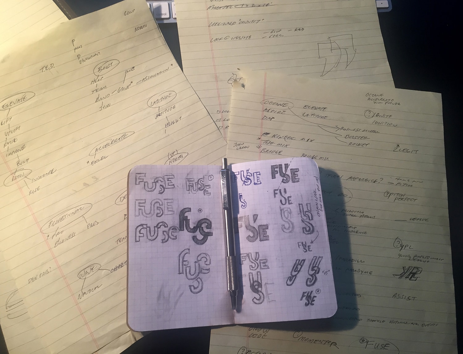
Every logo starts with brainstorming and sketching. The idea is to get as many ideas down as quickly as possible. When it comes to design ideas, I often say 9 out of 10 ideas are throwaways, so it’s important to get as many ideas out as possible. For logos specifically, it’s probably more accurate to say 1 out of 100, so time is really of the essence. For Fuse, I knew that I wanted to depict the idea of coming together—the act of actually fusing. I also knew that since the target audience is a younger demographic, I didn’t want something that was too obvious or anything that seemed stuffy or old school in any way. I wanted it to have a bit of an edge, while being simple, clean, and professional. If I could work an “aha” moment (where the viewer discovers something clever or interesting, aiding in the memorization of the design) in as well, even better.
Hours of sketching, sketching, and more sketching, finally led
to the kernel of the idea that would become the new logo:
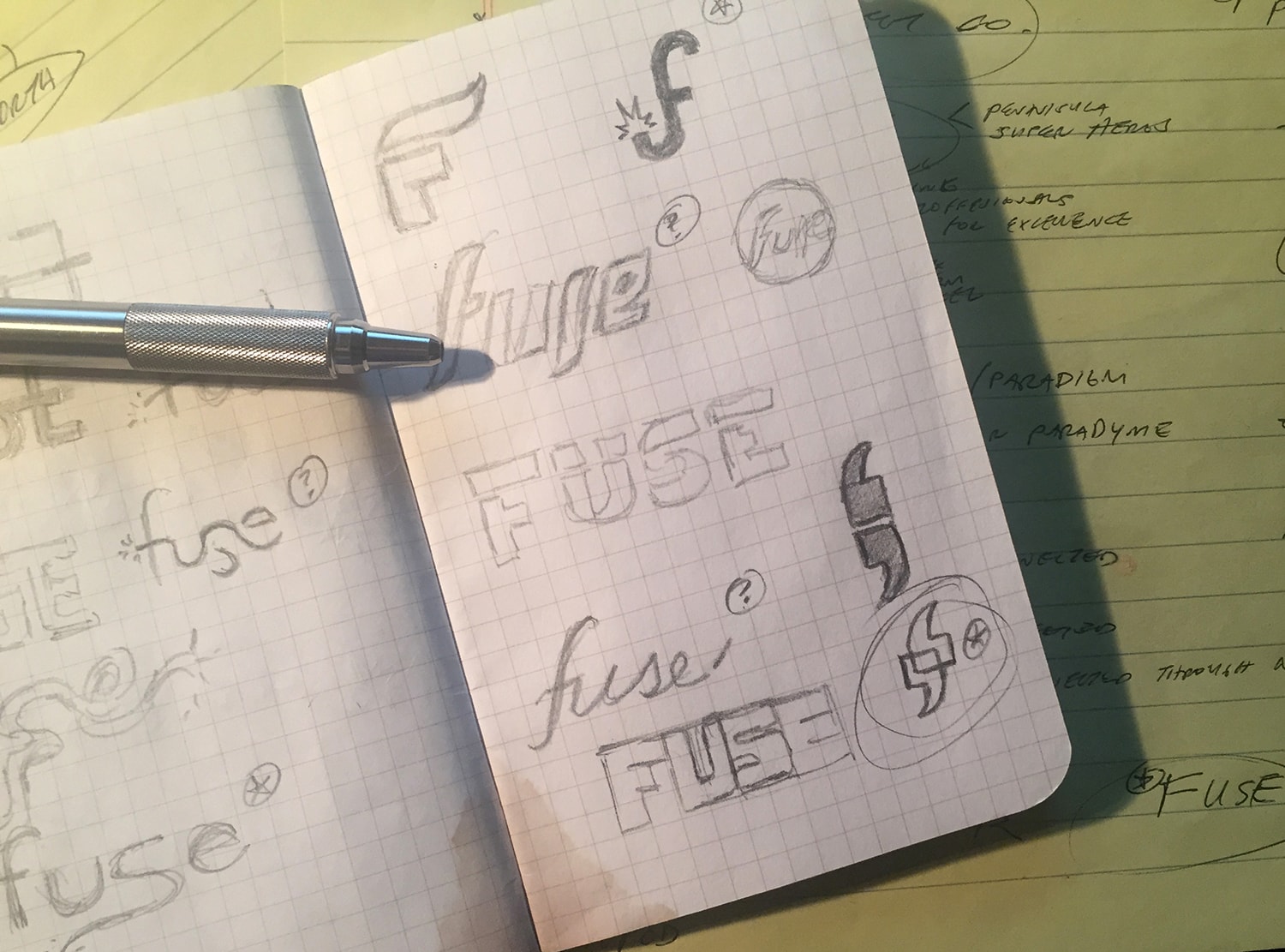
THE FUSE SYMBOL
The idea for the lowercase “f” in the new Fuse logo came from boiling down what TCYP does and provides for its members. Networking, talking, and sharing experiences to help each other grow is what the group is really all out. This is where the typewritten symbol that designates speech, quote marks, became an idea for the new logo design.
On their own, the use of quote marks didn’t help the visual design of the logo much. Through playing with the shapes, I found some interesting effects could be achieved. I discovered that by rotating one of the marks 180º and then overlapping the two shapes, a stylized “f” shape was formed. This design was honed to become the initial character for the word “Fuse.” The fact that it’s lowercase helps the design to feel a bit more casual and friendly, an ideal tone for the young audience.
Coincidentally, using the marks in this way, the visual created is abstract and can look like multiple images. The symbol can look a bit like speech bubbles that are overlapping (harkening the sharing ideas concept). It can also appear as geometric, stylized faces talking to each other. It’s a design that can appear to be many things, but they all point back to the core ideas of what Fuse represents.

STEP 3: BRAND ASSETS
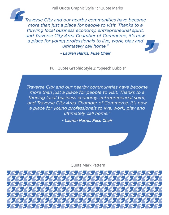
The last step of the Fuse logo design was to create some brand assets for the group to use for various marketing materials. These assets are a great opportunity to further define the brand, as well as provide versatility for the brand displayed in a myriad of ways that are attractive to the target audience.
For this, I provided the Fuse team with graphics based on the shapes found in the fuse symbol. A “mock ad” was also created to display how these elements can work together to form complete visuals.
A “mock ad” showcasing how the brand assets can
work together to create dynamic visuals:

THE RESULT
In the end, the Fuse team members are very happy with the end result. With the new brand, we captured the essence of the group and also helped them to feel more modern and with the times. Every project is an interesting journey and I never know where each path will lead, and this was no different. By working together with the Fuse team, we were able to define the problem at hand, strategize the best means to solve it, and then deliver a new name and logo design, all within a brand that will serve the group well for years to come.
What do you think of the project? Feel free to leave a comment below!
MORE INFO
To learn more about The Traverse City Chamber of Commerce and Fuse, visit TCChamber.org
If you’re in need of digital marketing help, visit LeadPlan Marketing at LeadPlanMarketing.com
I think it’s fantastic! I especially love how the brand assets utilize the logo elements. Thank you for the glimpse into your process. I can’t wait to see what you do with my upcoming project!