THE WORKSHOP BREWING CO
Project Brief:
The Workshop Brewing Company is a brewpub that prides itself on a foundation of nature, community, and craft. They came to us looking to eliminate the workload of managing their marketing themselves, as well as grow their revenue. The metrics we set for our KPIs were to grow revenue by at least 5% above the current growth they had been seeing year over end.
The Diagnosis:
Through our discovery phase, we found that the Workshop’s brand messaging and execution of that messaging could be an issue that limits the revenue goals. We confirmed this through field research which along with SWOT and competitor analysis, consisted of interviews of key employees, questionnaires for patrons (in exchange for “penny beers”), and secret shopping.
After confirming that the Workshop’s messaging was a bit too revolutionary-centric, which was polarizing its patrons, we helped them to develop an evolved messaging strategy that is more welcoming and inclusive, while still maintaining the edginess of the brand that the owner desired.
The Workshop’s audience consists of two primary groups; the local year-round community of Traverse City and tourists visiting during the summer months. The new messaging needed to speak to both groups while illustrating what makes the Workshop special and why it’s a “must-visit” destination for the area.
Project Specs
Project Type: Marketing and Brand Strategy
Services: Marketing Strategy and Execution, Brand Strategy and Execution, Creative Services (Website Design, Ad Copy & Design, Print Design, Signage Design, Photoshoot)
Project Results
KPI Goal: Increased revenue of 5% year over end (over previous year) within $50,000 budget
Result: 11% increase over forecasted revenue, resulting in $330,000 in additional sales
Website Design & Messaging
Click on image to scale
Showcase the Brand
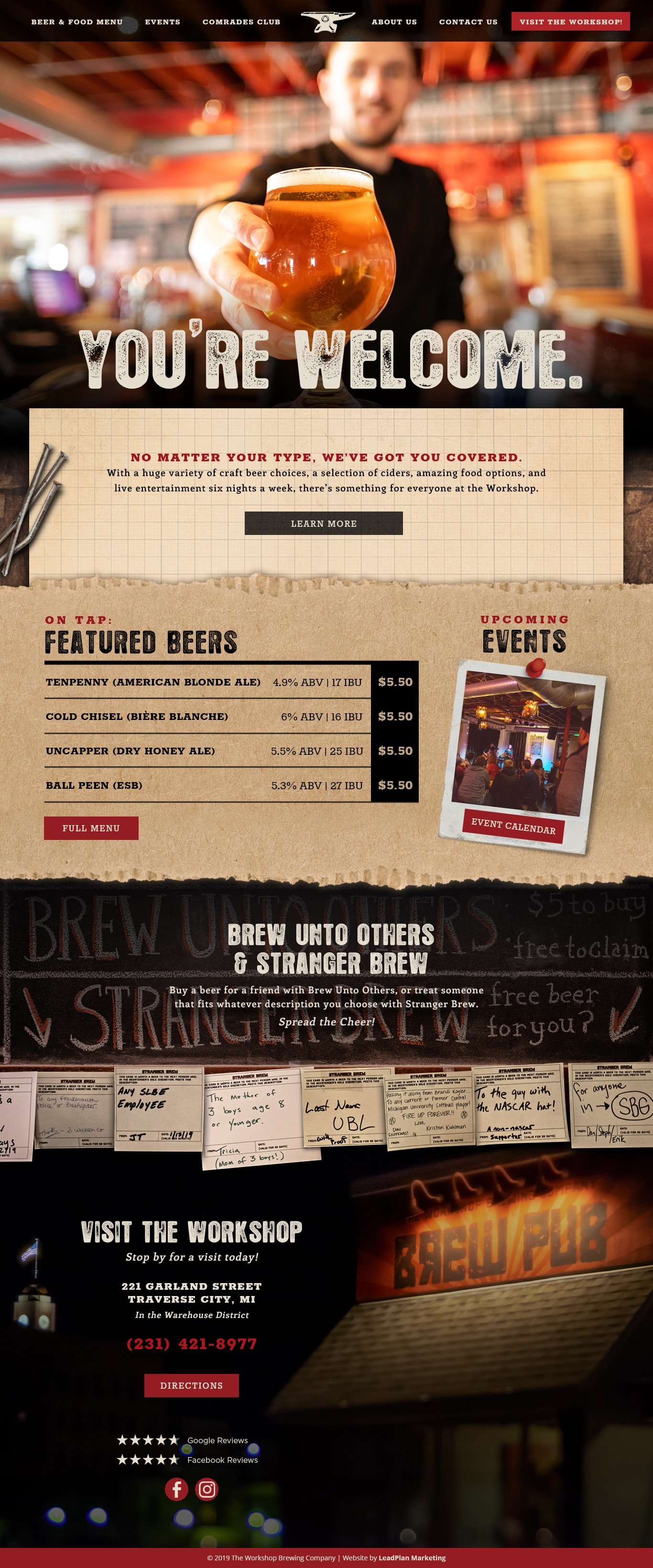
The goal of the website redesign was to accurately reflect the new brand messaging – welcoming, fun and lighthearted with a bit of blunt humor that’ll make you smile (or roll your eyes).
A Warm Welcome
To play on the welcoming, albeit sometimes snarky, nature of the new messaging, we wanted the introduction of the website to set the right tone. The viewer is greeted by a photo of a bartender handing out a cold beer, accompanied the message: “You’re Welcome.” that uses a bit of wordplay, allowing it to be taken a few different ways.
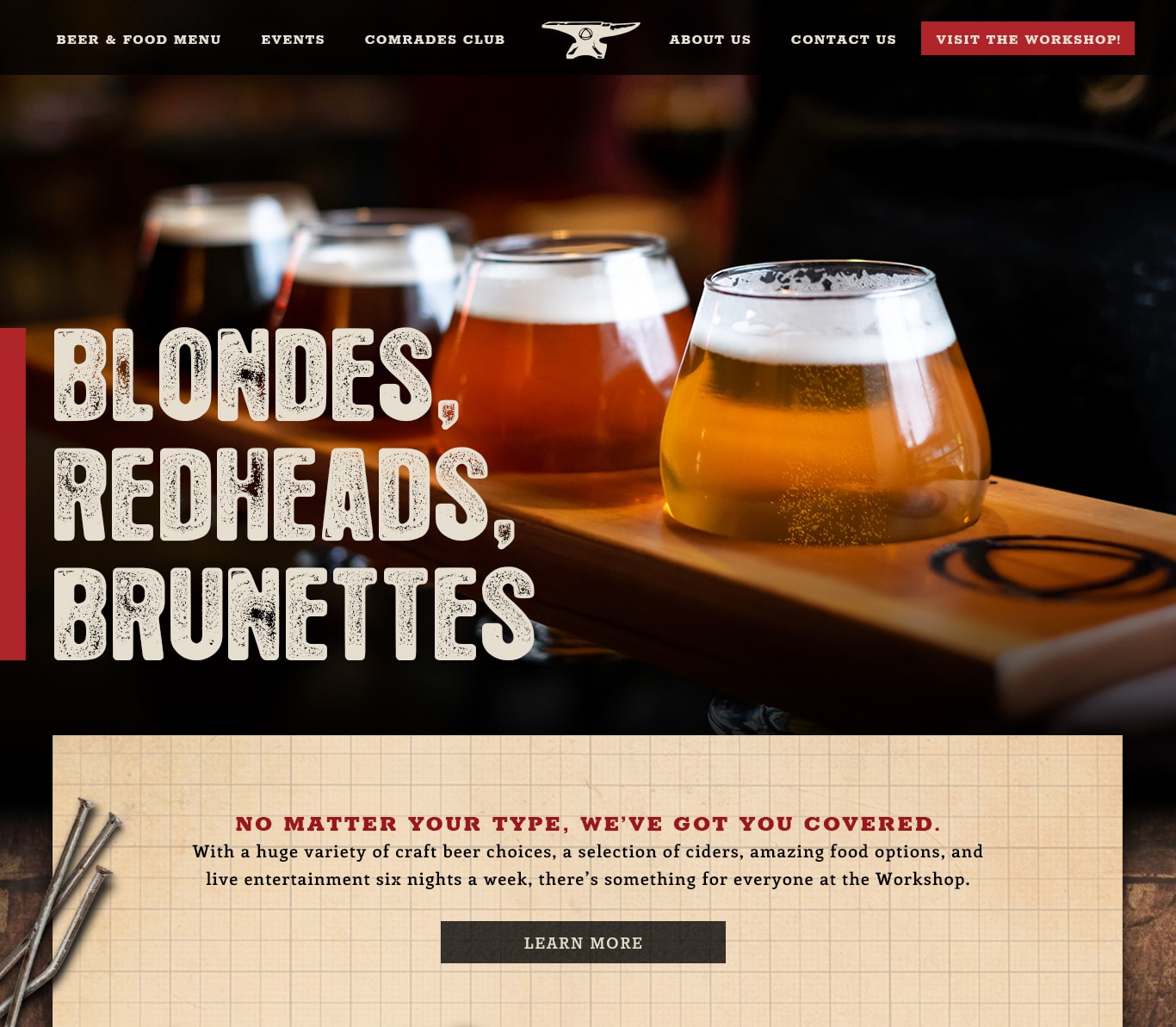
Adaptable Design
To help keep the site’s look fresh, we created a design that’s modular and adaptable, allowing the Workshop to experiment with different intro/welcome messages. Below is an example of a witty welcome message referencing various styles of beer.
(Click image to see full-size)
Atmospheric Design
To create a “workshop” vibe, we incorporated heavy layering of distressed textures found within both The Workshop’s physical space and that of actual industrial workshops. Incorporating these elements allowed us to elevate Workshop’s character throughout the site, differentiating it from competitor websites.
Photography
An on-site photoshoot provided us with warm and welcoming environmental and community-based shots as well as great product-focused hero images used in bringing the new website design to life.
Previous Design
The previous website was struggling to communicate the right message to the Workshop’s audience. In some cases, patrons wondered if there was a political play.
(Click image to see full-size)

Brand Message Strategy
We utilized our brand scripting process to examine what problem or “pain point” The Workshop was addressing for their patrons. Through our process, we found that The Workshop was unique in offering a gathering space for all people, regardless of interests or background, therefore we highlighted this distinct positioning with the new messaging.
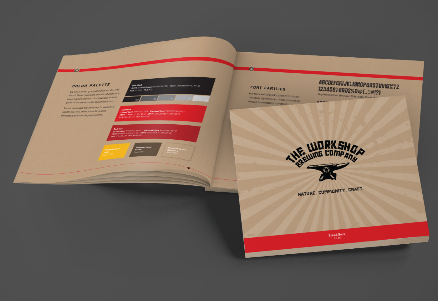
Brand Book
We created a brand book to clearly outline the new brand strategy for both internal team members of The Workshop, as well as vendors assigned to the creative team for the duration of the launch phase.
The cornerstone of the book is The Workshop’s mantra, “Nature. Community. Craft.” The book’s purpose is to capture the business’ vision while also clearly defining the roles of their employees in the vision and instructions on how to implement their new branding, including clear instructions on how and when to use the logo, graphic design, fonts, photography
Click on image to enlarge
Advertising
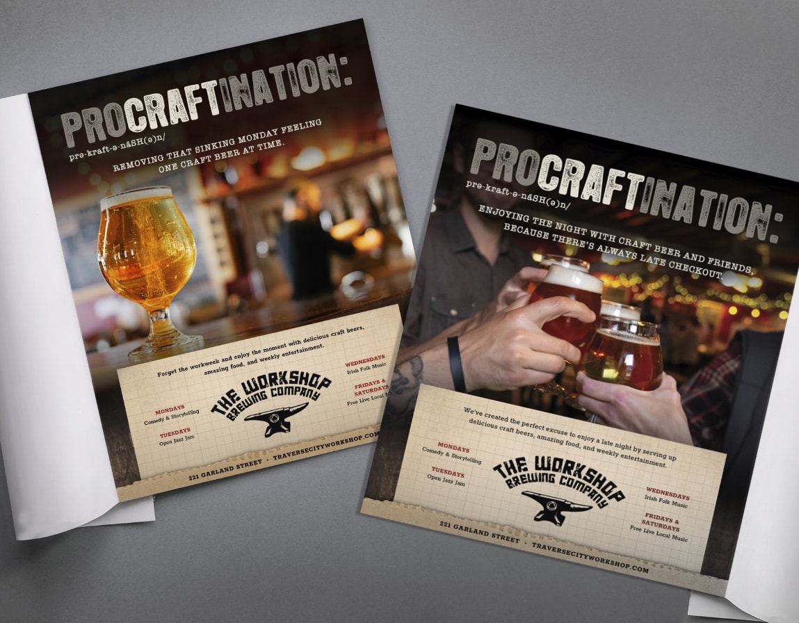
Procraftination Campaign
As part of the new brand strategy rollout, we created a series of ads, namely our “ProCRAFTination” campaign, which featured humorous takes on what the made-up term means for various scenarios. The ads below were aimed at tourists and placed in popular publications during the summer months and encouraged people to stay at The Workshop for just one more.
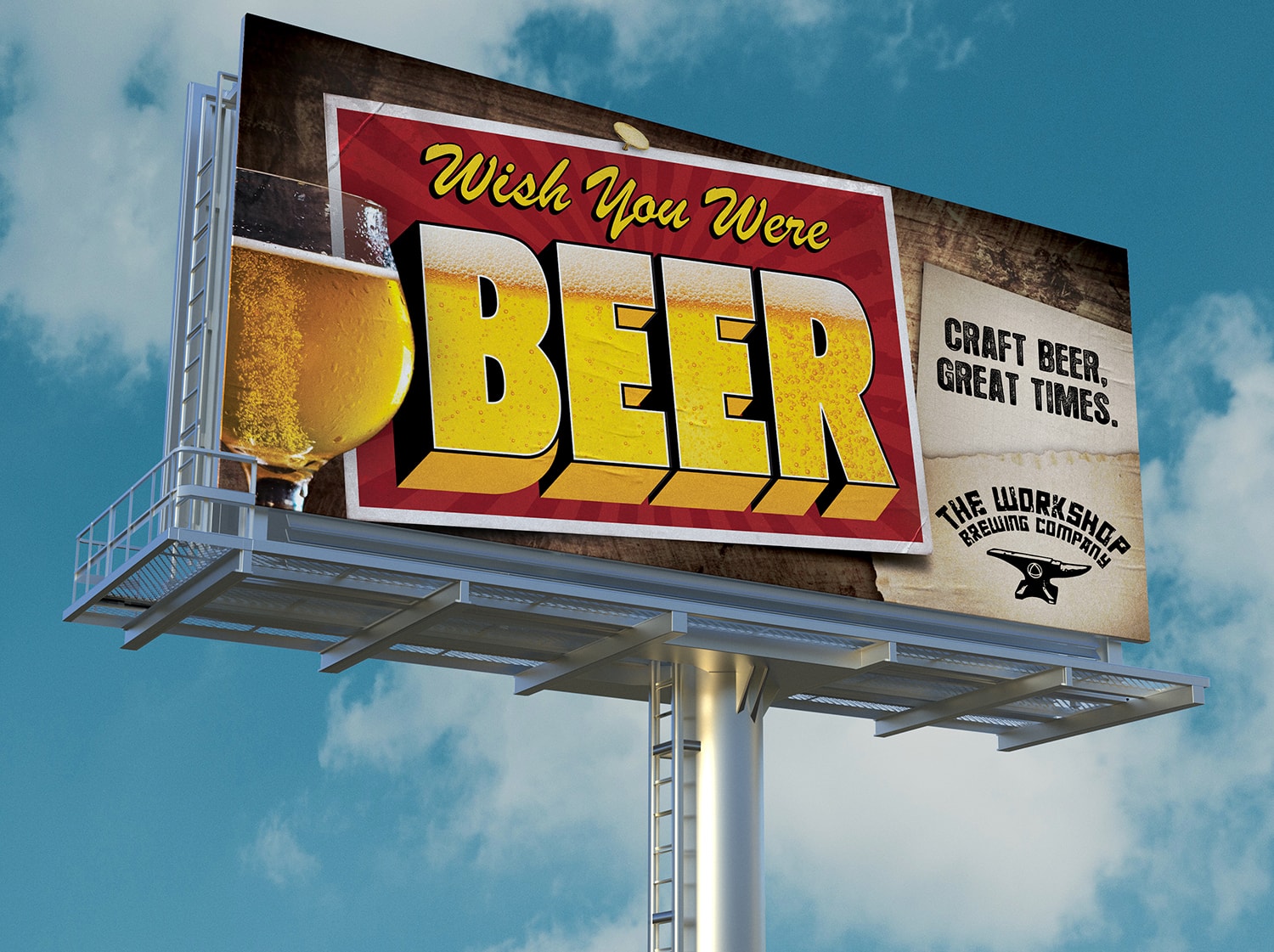
Billboard Design
Another tactic used to target tourists was the strategic placement of billboards throughout the community during the summer months. Again, highlighting The Workshop’s playful sense of humor, the billboards mimicked the typical “Wish You Were Here” post cards, highlighting instead the brewpub’s signature craft beer.
Click on image to enlarge
Click on image to enlarge
Video Production
As part of the larger messaging strategy, we created a video highlighting why The Workshop is a “must go” destination while tourists are visiting Traverse City. We partnered with the owner to write the script and deliver a high-quality sizzler reel that played in hotel rooms throughout the city during the summer months.
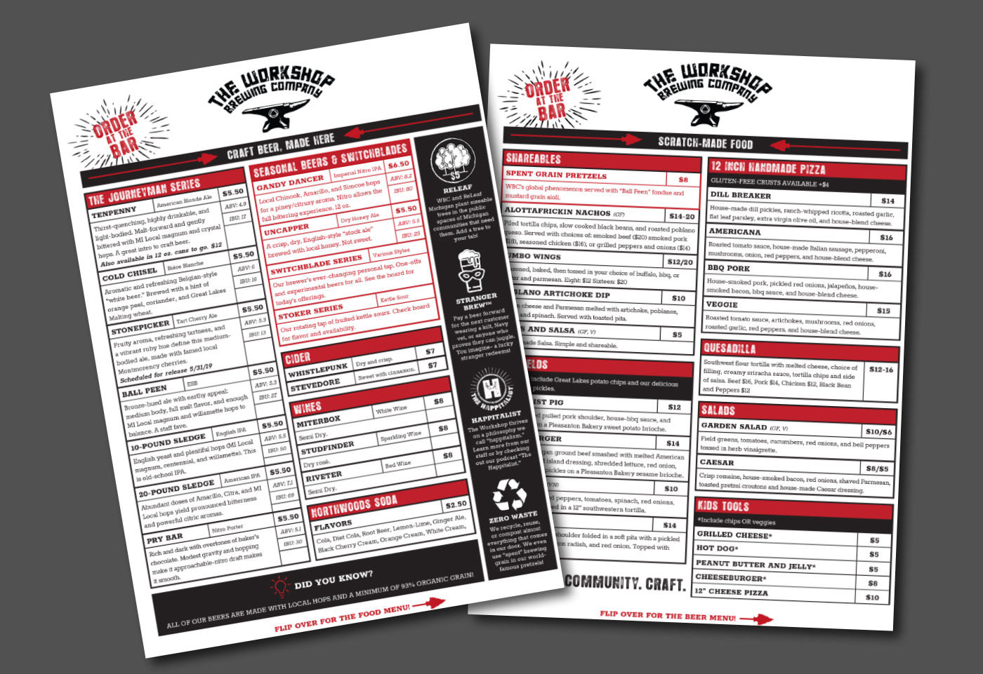
Menu Design
Perhaps one of the most important pieces of the new brand rollout was designing new menus that fit the welcoming, fun, local vibe of The Workshop’s messaging. The redesign was inspired by a vintage order form while using modern design elements to highlight unique features of The Workshop as a local favorite.
Click on image to enlarge
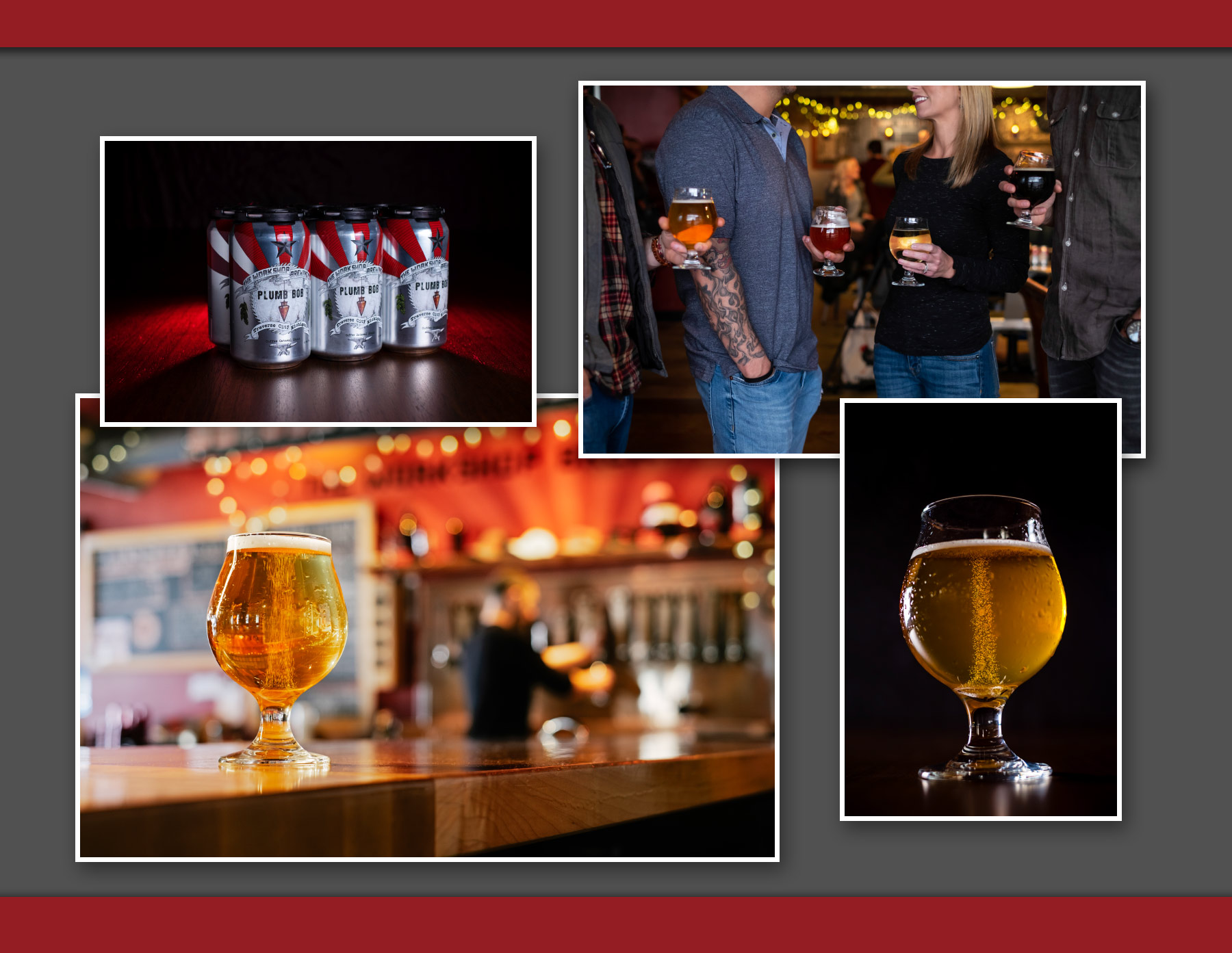
On-location Photoshoot
We determined that real-life imagery of The Workshop Brewing Co, their space and craft beers should serve as a core part of the new brand. Our team conducted a two-day photo shoot that captured the interior of the brewpub, the local community, the Workshop’s craft beers and food, as well as a live music event.
The photos were taken with shallow depth of field, blurring edges and pushing products forward, creating an up close and personal feel. These images were then paired with bold graphic elements and the brand colors, along with distressed vintage fonts—completing the heritage inspired tone we were looking to create.
Click on image to enlarge