Virnoux
Virnoux came to us looking for help with introducing their new male fertility supplement. Created by two male fertility physician-scientists, Virnoux was formulated to help men improve their sperm quality and DNA.
The brand went through both out Brand Script and Brand Scape processes to find both their voice and their visual identity. We recognized very early in the branding process that the final product that this supplement was providing wasn’t just improved sperm health, but the opportunity to become a parent. We used this emotional connection to build the brand into one that was optimistic, trustworthy, and confident.
Services Provided
Marketing Strategy and Execution, Brand Strategy and Execution, Creative Services (Logo Design, Website Design, Label Design, Ad Copy & Design, Print Design, Video Creation)
Brand Scapes
Once our copywriters pinpoint the brand’s voice and tone, we use that to inspire the creation of a visual identity—something we call out Brand Scape process. Brand Scapes allow us to explore different visual directions for a brand with explorations into fonts, colors, typography, photography, and more. This guide becomes the foundation for all future visual work we do, including the website, labels, and social media.
Keeping in mind the strategy of focusing on the emotional aspect of the brand, rather than just the technical, we set out to create the options for Virnoux.
Option 1
Establishing trust and making an emotional connection are major parts of any brand, but with a topic as delicate as fertility, it was of particular importance. This Brand Scape set out to achieve those goals with a color palette that is confident and comforting. The photography used was intended to showcase the relationships that are important throughout a journey to fatherhood.
Option 2
While option 1 explored darker and comfortable colors, option 2 explored the idea of gaining trust through a brighter and more luxurious tone—leaning on the concept of gaining trust through the scientific side of the formula more. It’s brighter color palette evokes a good deal of optimism and confidence.
Option 3
Option 3, the version the client decided to move forward with was a combination of the comfort of option 1 and the scientific of board option 2. The colors used in this option aligned to the male audience of the product, and was able to achieve the level of quality they wanted to communicate. The diagonal lines used throughout the design gives the entire Brand Scape a sense of movement, mirroring the progress the product provides men on fertility journeys.
Label Design
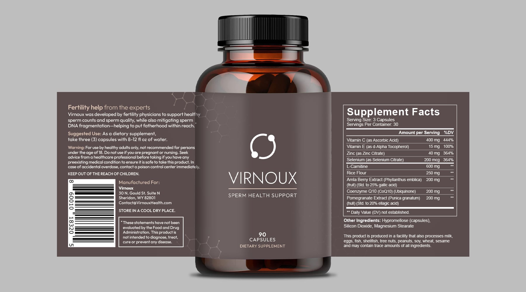
For the label, the client was already thrilled with the version we created for the Brand Scape. We pushed the design further with the addition of the hexagonal pattern to add more of an association with the scientific nature of the product as well as a visual texture. To better fit the shape of the bottle they selected, we changed up the logo as well, opting for a stacked version to allow for a more efficient front-facing display.
Logo Design
For the logo, we wanted to represent the sense of progress that users would experience when taking the supplement. The “cycle” symbol we designed helps show both the forward momentum, but also is meant to represent the healthy sperm that men can expect when taking the product.

Stacked Version

Horizontal Version
Video Production
We created a commercial for the launch of Virnoux that features inspiring graphics synced to upbeat music, and using the design guidelines we established in the Brand Scape process.


