WILBANKS ENERGY LOGISTICS
Wilbanks Energy Logistics is a company that provides various services around rig mobilization within the oil industry. Serving as Creative Director for Identity, my team and I set out to develop a new brand platform that better suited their evolution to more technology-driven services.
The new brand needed to reflect the level of professionalism and technological sophistication Wilbanks Energy Logistics brings to the oil and gas industry while staying true to the company’s trucking roots and relevant to the company’s audience. This audience consisted of two primary groups; the business people within oil companies and hired trucking companies and drivers. Given the blend of white collar businessmen and their blue-collar counterparts, it was determined that an internally dubbed “roughneck tech” tone would be the core essence of both the brand image and brand message.
Project Specs
Agency Identity PR
Project Type Brand Platform Creation, Brand Creative Execution (Logo Design, Website Design, Print Design)
Services Creative Direction, Graphic Design, Copywriting, Digital & Offset Printing
View WilbanksEL.com
Project Case Study
Design Strategy
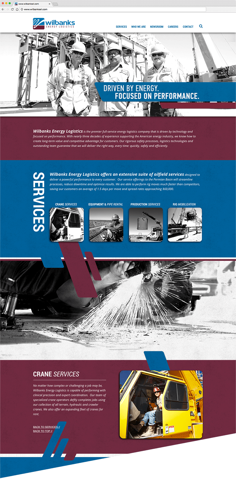
The site is designed in a one-page format, which as you scroll down, images and graphic elements float upwards to create the sense of drilling down, as for oil, into the earth.
Bold Introduction
A confidence-inspiring image of Wilbanks team members with the tagline: “Driven by Energy. Focused on Performance.” meets the viewer to set the tone for the website and the brand.
Parallax effect
We incorporated an innovative use of parallax coding, which enabled us to vary the speed at which certain elements moved as the viewer scrolled down through the website. This allowed us to create various levels of visuals that built upon each other to create a visual depth to the website.
Photography
An on-site photo shoot in the Permian basin provided us with the gritty hero shots used in illustrating the Wilbanks story.
Content Layers
Each subject area within the website was contained within a layer, to reinforce the idea of moving down through the earth. As the viewer scrolls to each section, the black and white images within illuminate to full color.
Award Winning
The Wilbanks website earned the “Gold Winner” award from Hermes in 2014 for Exceptional Website Design.

LOGO DESIGN
The new logo’s symbol execution features many unique elements that combine to tell the Wilbanks Energy Logistics story:
While the primary reason of the flowing line moving across is to serve as a “W” for the Wilbanks name, the variation of the line’s weight is used to create a sense of movement and perspective—depicting the image of an undulating roadway. As the line moves forward, it leads the eye to the letterforms of the logo.
The color fields that the roadway sits atop are segmented into two sections, a blue upper section representing the sky and the deep red/burgundy lower section representing the red earth of the Permian Basin. The burgundy color was also chosen to tie back to original Wilbanks Trucking brand, which featured the color almost exclusively.
The movement of the line in and out of these color fields represents the idea of pulling oil from belowground and transporting it above.
HERMES CREATIVE AWARDS — GOLD WINNER
Along with the website, the Wilbanks logo earned the “Gold Winner” award from Hermes in 2014 for Exceptional Logo Design.
Print Design
A full array of printed materials, showcasing the new brand strategy, were produced to meet various marketing needs for Wilbanks.
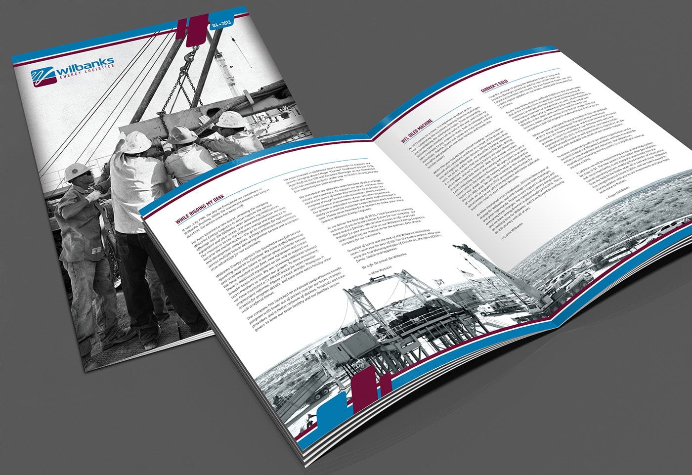
An internal communications program was created to enhance employee engagement and deliver a new level of transparency. The design focused heavily on the Wilbanks team through imagery. The newsletter’s content was a combination of company vision, important reminders on safety and training, employee recognition, and the family culture Wilbanks has worked hard to maintain.
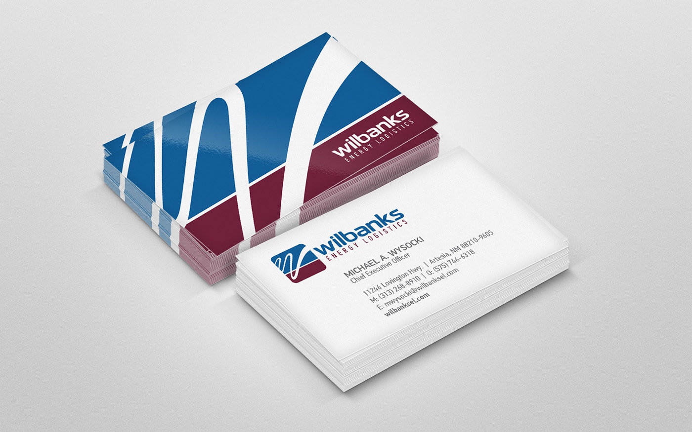
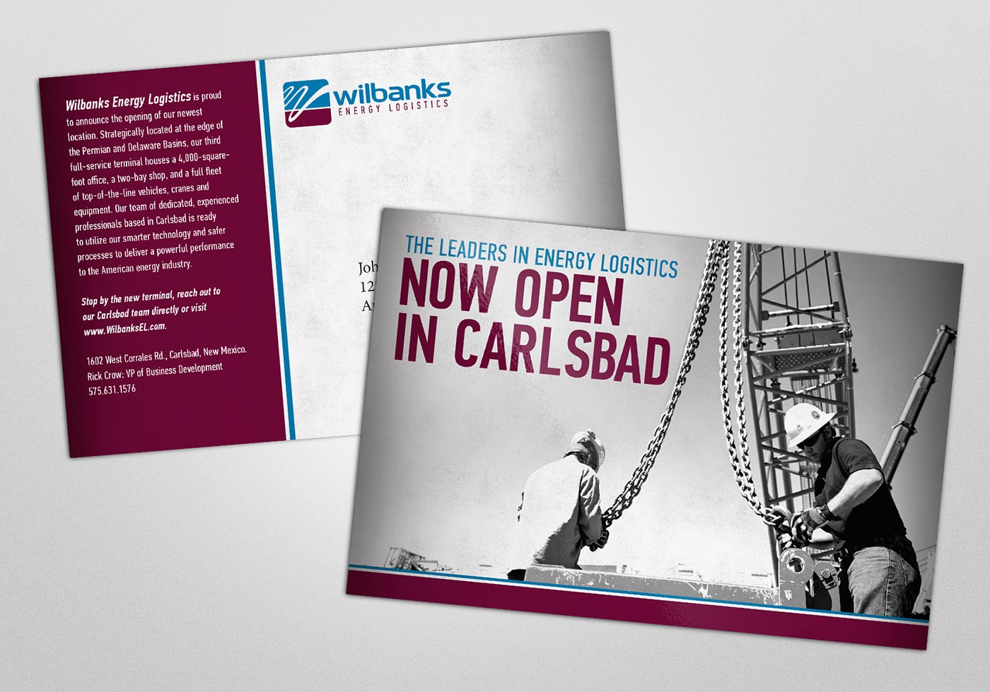
Along with the newsletter, new business cards, direct mail, and billboard advertising rounded out the printed elements of the brand.
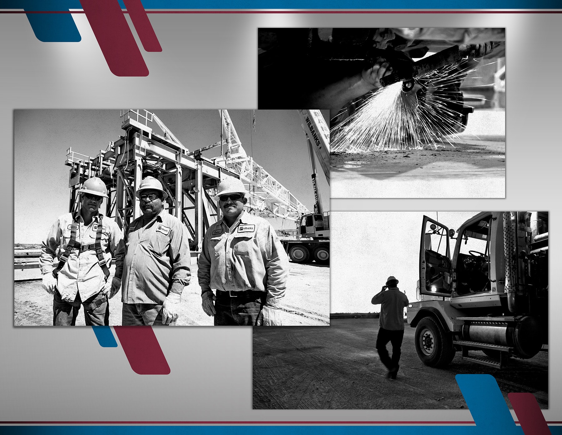
On-location Photoshoot
Along with the logo and color palette, we determined that real-life imagery of the Wilbanks team and their complex work should serve a core part of the new brand. Our team flew to Artesia, New Mexico, the company’s headquarters, to direct a two-day photo shoot that captured the company’s team members, equipment, landscape, and projects—including a full oil rig move.
The photos were then manipulated to create the high-contrast, granulated look we used to complete the rugged, road-worn look. These images were then paired with bold graphic elements in the brand colors, along with smooth, crisp lines and modern fonts, completing the “rugged yet progressive” tone we were looking to create.
Let's Make Contact
Please feel free to email, call, or use this form to send a message and you will receive a response as soon as possible.
Thank you.